Maserati Logo: History, Meaning, and Every Redesign Since 1926
Home > Blog >Maserati Life > Maserati Logo: History, Meaning, and Every Redesign Since 1926
Author: Maserati of Fort Lauderdale
March 1, 2026
Share this post:
Facebook
Twitter
LinkedIn
Email
Table of Contents
What Does the Maserati Logo Mean?
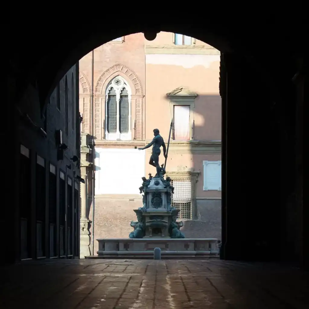
The Maserati logo is a trident inspired by the Fountain of Neptune in Bologna, Italy. Sketched around 1920 and refined by Mario Maserati, it stands for power, control, and performance — and it’s remained unchanged in concept for over a century.
How the Logo Has Evolved
The Trident’s concept hasn’t changed since 1920. Instead of redesigning the identity, Maserati has refined the shape and finish over time to match changes in engineering and branding:
1926
1933
1980
1997
2005
Today
The biggest shift was 1926 to 1933 — rectangle to oval. Everything since has been refinement, not reinvention.
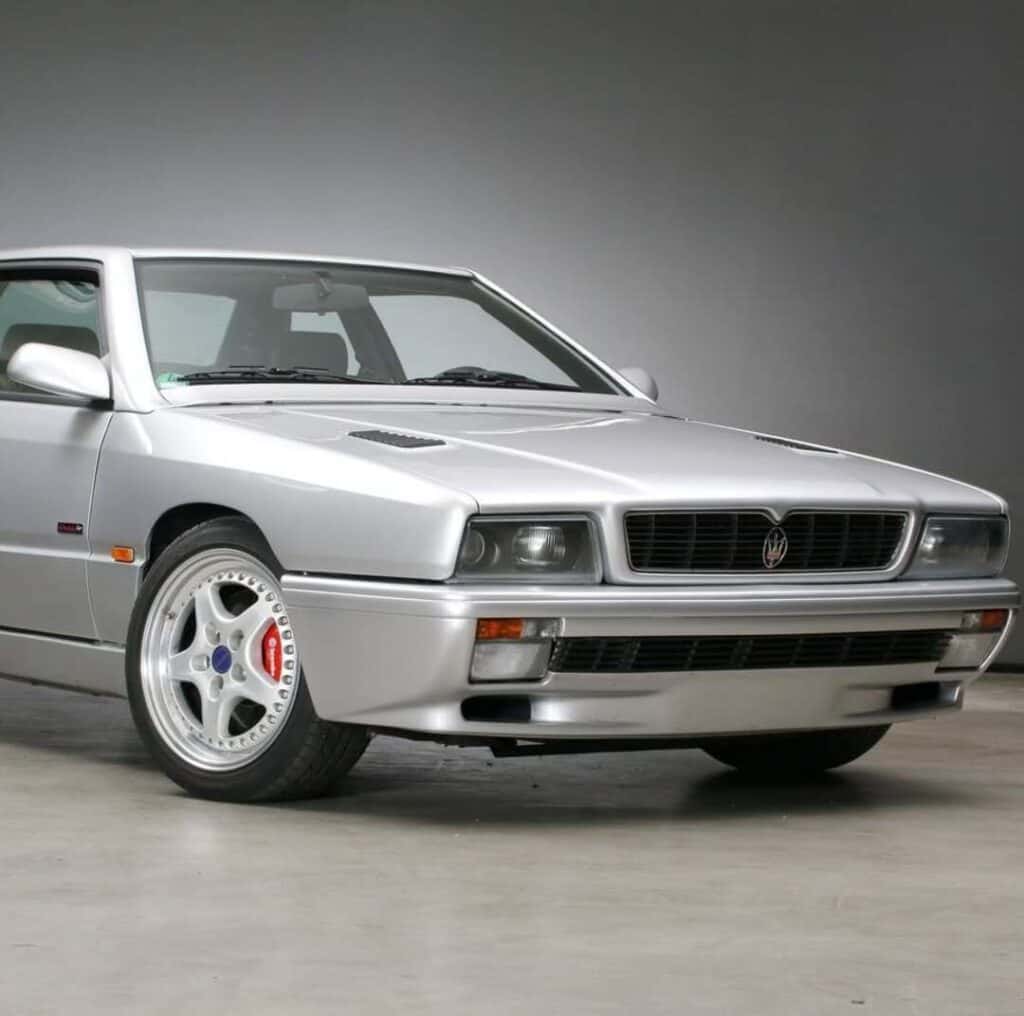
There’s also a second version worth knowing: the “Saetta” logo, used on the C-pillars of cars like the Quattroporte and Ghibli. It underlines the trident with a thunderbolt — a nod to speed and performance — and traces back to 1963.
The Origin of the Maserati Trident
Maserati was founded in Bologna in 1914. Around 1920, the family wanted a symbol to match the racing spirit of the company.
That idea came from a family friend: Marquis Diego de Sterlich, a racing driver. He pointed to the Fountain of Neptune in Bologna’s Piazza Maggiore — Neptune’s trident captured the strength the brothers wanted their cars to project.
Mario Maserati — the family’s artist, trained at Milan’s Brera Academy — turned that idea into the design.
1920 to 1926: Sketch to Debut
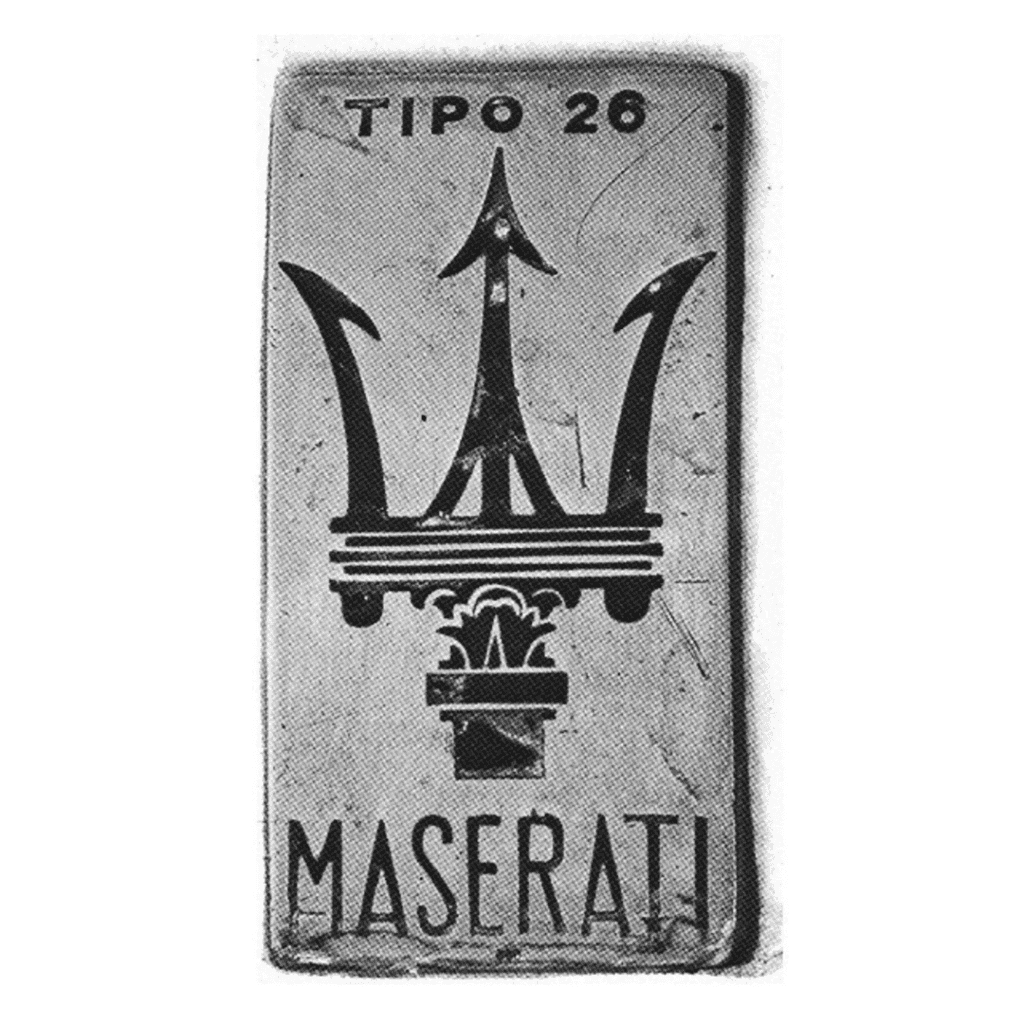
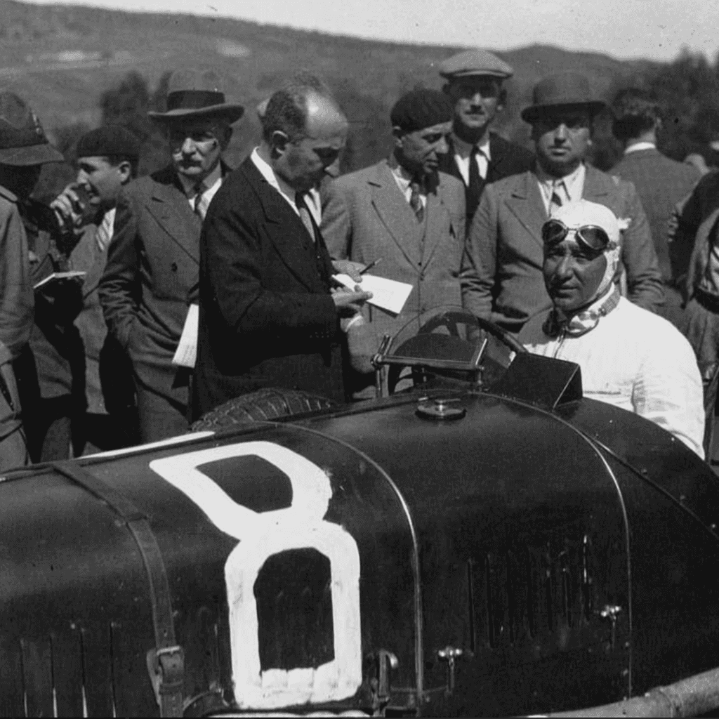
The logo was finalized around 1920, but sat unused for six years as a family mark. On April 25, 1926, it debuted on the Maserati Tipo 26 at the Targa Florio — the brand’s first race car.
That first badge looked nothing like the ovals that followed. It was a tall, vertical rectangle, crafted as a silver metal plaque bolted directly onto the hood. The trident artwork was ornate and heavily detailed, with intricate shading meant to echo the actual stone statue in Bologna. A thin, capitalized sans-serif “MASERATI” sat cleanly across the bottom.
Every Maserati since, road or racing, has carried the trident in one form or another.
1933: The Oval Takes Shape
The first emblem, applied to the Tipo 26, was a rectangular badge with a dark trident on a light background — a graphic solution that was short-lived.
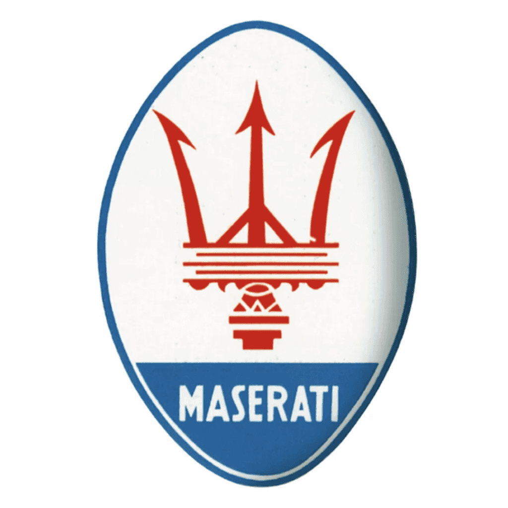
By the early 1930s, Maserati moved toward the oval shape that would define the brand going forward, adopting the red and blue colors of Bologna.
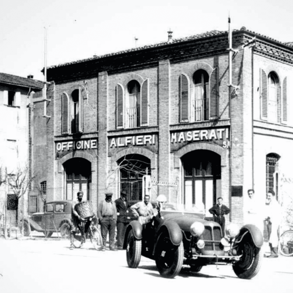
Maserati stayed in Bologna until 1937, when the Orsi family bought the company and moved headquarters to Modena in 1940 — where it remains today.
1980: Gold Era
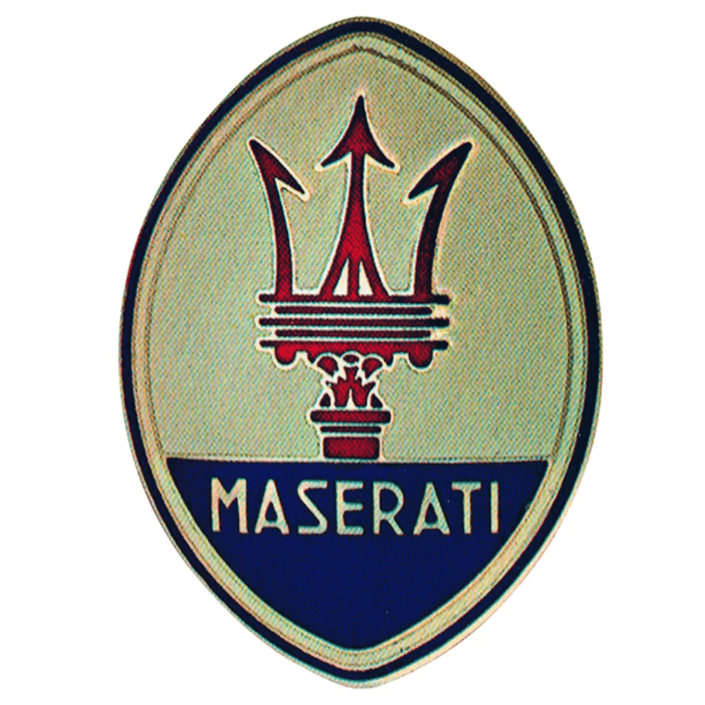
The 1980 redesign kept the familiar vertical oval but swapped in a metallic gold background — a shift that carried through the brand’s entire lineup that decade, including the Biturbo series.
The trident itself changed too: the traditional red gave way to a deep navy blue, rendered in the same tone as the “MASERATI” wordmark below, for sharp contrast against the new gold field.
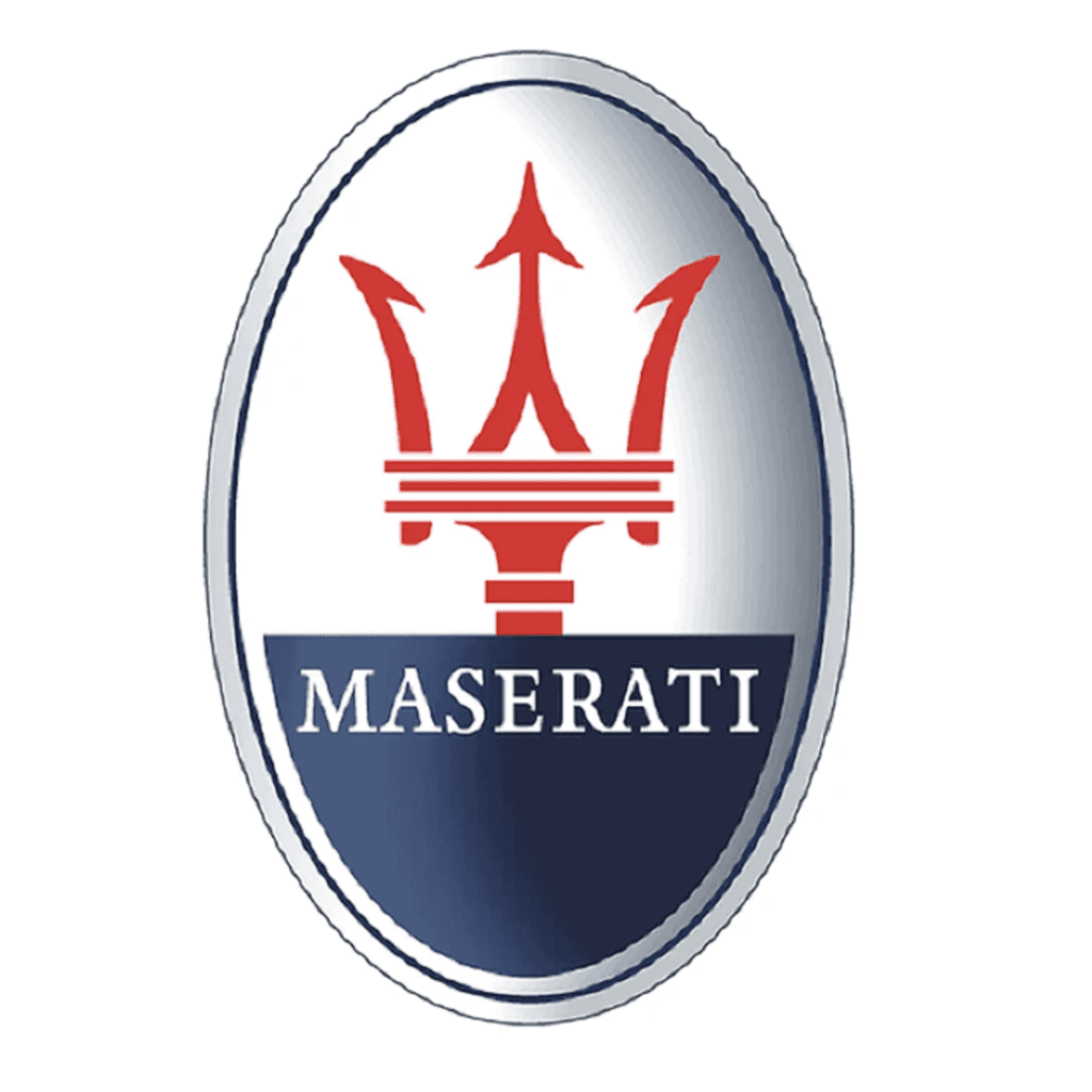
1997: A Sharper Silhouette
Ferrari’s takeover brought a full relaunch, and the badge changed with it.
The oval stretched longer and narrower, the trident was redrawn with thinner, sharper lines, and the “MASERATI” wordmark shifted to a classic serif — closer to a refined Times New Roman than the sans-serif style before it.
It was the most dramatic proportion shift the logo had seen since 1933.
2005: Balance and Depth
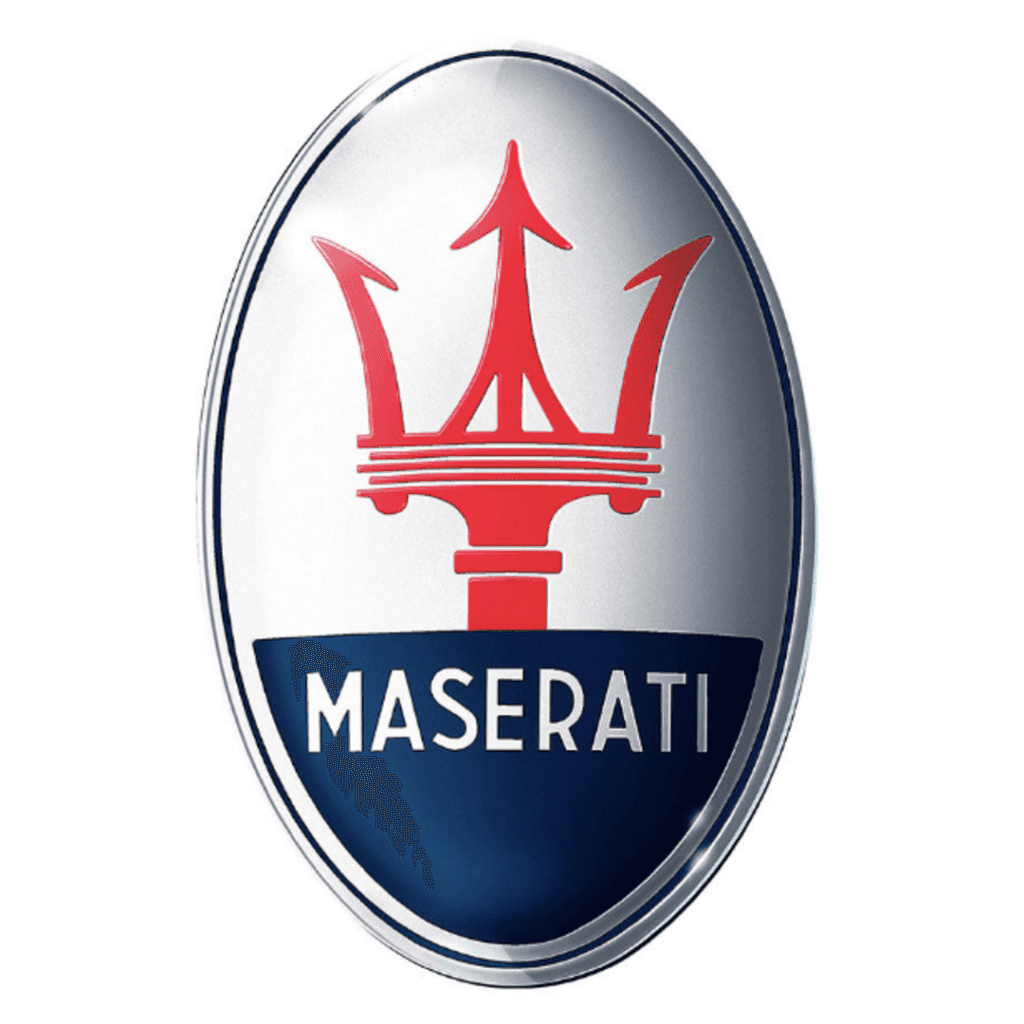
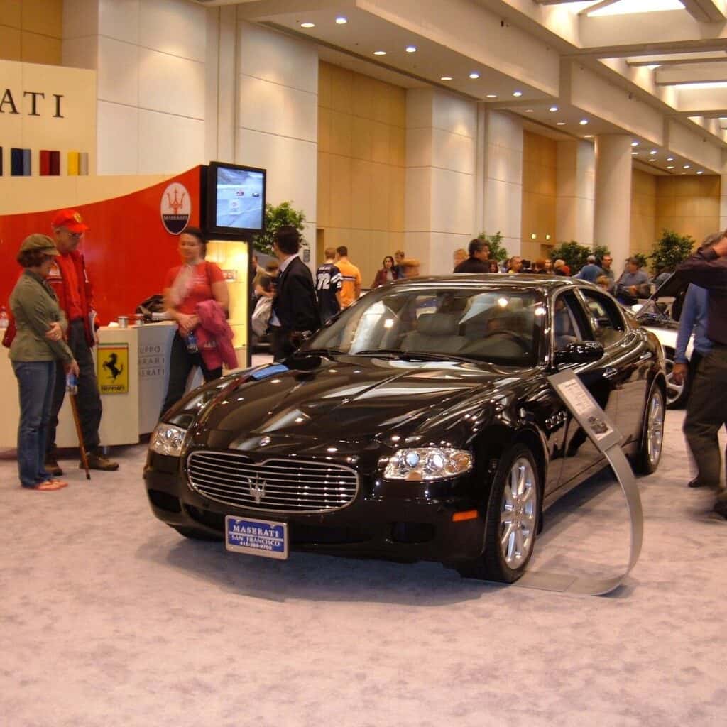
Ahead of the 2006 model year, Maserati refined the 1997 oval into a more balanced design that would last fifteen years.
A clean split separated the red trident from the blue field below, the side arrows were reshaped to look lighter, and the wordmark shifted to a high-contrast serif with sharp points echoing the trident itself.
Maserati also began adding subtle gradient shading, giving the badge more depth on both screens and print.
Today: A Clean Break
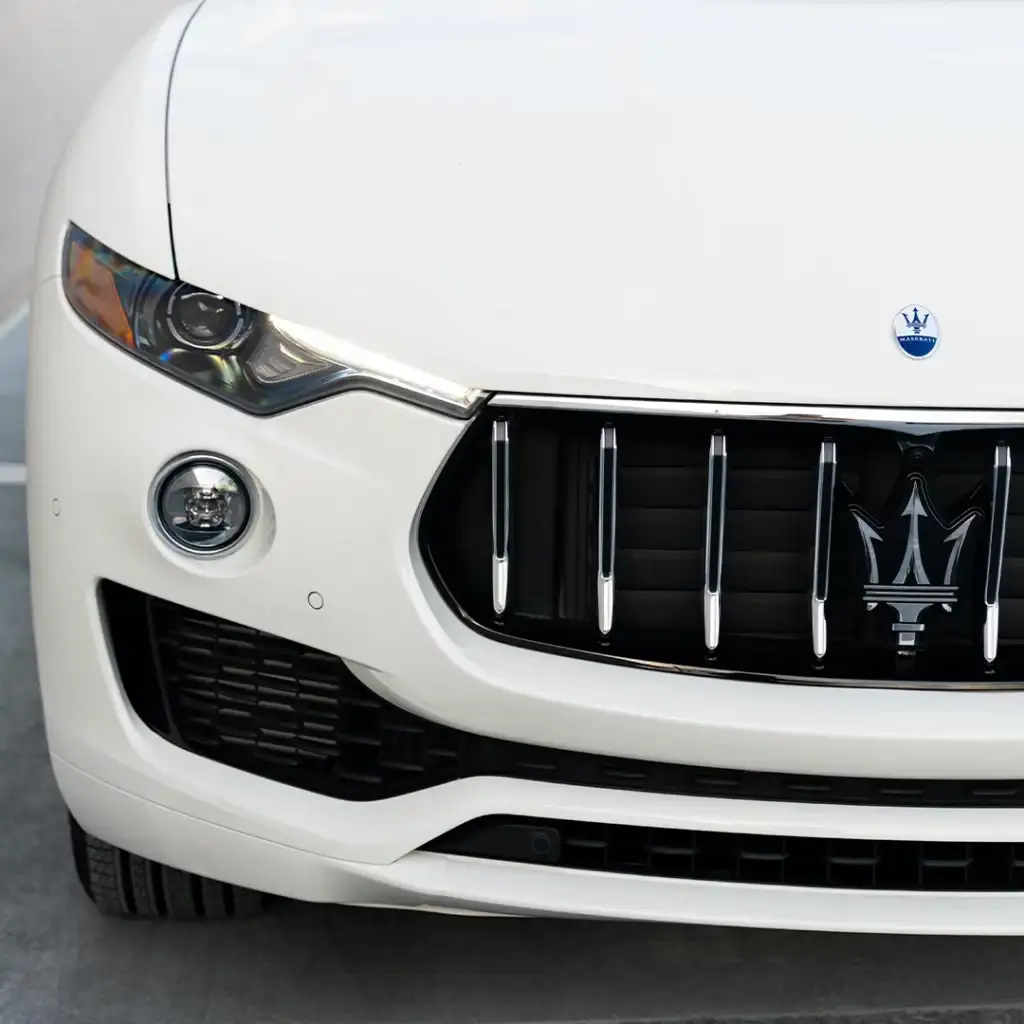
The most recent update arrived in 2020 alongside the MC20 supercar.
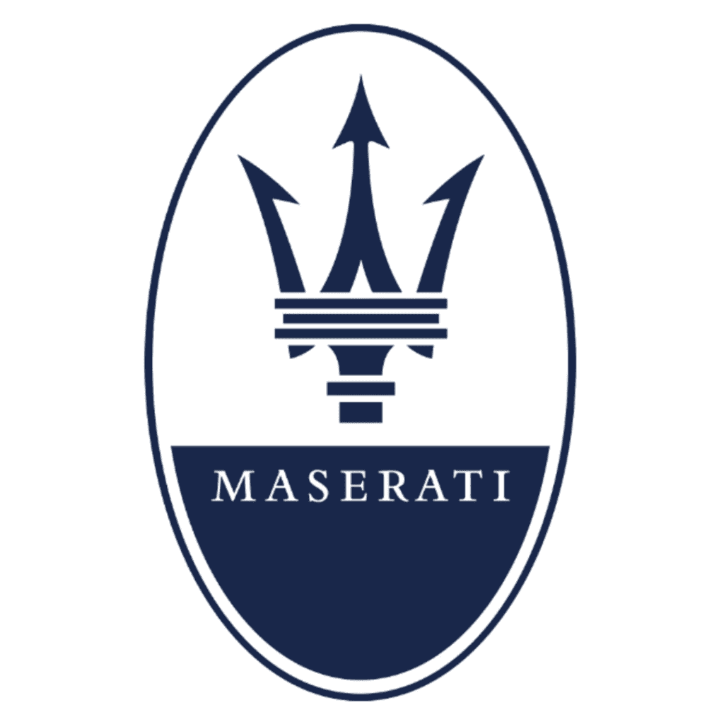
Gone are the oval enclosure and dividing bars — the trident now stands alone, rendered in flat dark blue on white, sitting independently above a flattened, screen-friendly wordmark.
A century after Neptune’s fountain inspired the original sketch, the symbol finally stands on its own.
Why the Trident?
Neptune commands the ocean with his trident — raw natural power. For a new race car brand, that was the whole pitch: strength and control in one symbol.
It also captures something Maserati still leans on today: a brand split between two identities. Elegant craftsmanship on one side, competitive speed on the other — the Trident doesn’t have to choose between them.
What the Colors Mean
Blue — the sea, Neptune’s domain; elegance and refinement. (Also happens to be one of Bologna’s civic colors.)
Red — speed and energy; the race-bred side of the brand.
White/silver — balance, and a backdrop that keeps the trident the focal point.
Where You'll Find the Logo Today
The Trident isn’t just a badge on the hood. Maserati works it into the car itself, in a handful of places you’ll spot once you know to look:
Grille — the main badge, front and center on every model
Hood ornament — on select models, a raised trident sits above the grille
Wheel centers — a smaller trident on the center caps
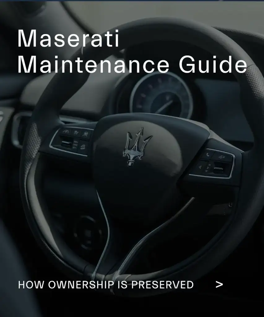
Steering wheel — embossed at the center of the wheel
C-pillar — the Saetta version, trident with a thunderbolt underneath, on cars like the Quattroporte and Ghibli
Seats and interior trim — stitched or embossed on higher trims
It’s one of the few details that ties every generation of Maserati together — a Tipo 26 from 1926 and a new Ghibli or Quattroporte carry the same mark, just refined.
The Maserati logo features a trident symbol that represents power, control, and performance. It is inspired by the statue of Neptune in Bologna, connecting the brand to its Italian heritage.
Maserati uses a trident because it symbolizes strength and authority, inspired by Neptune, the Roman god of the sea. It reflects the brand’s focus on performance and precision.
The logo was designed by Mario Maserati, the only brother with an artistic background. He created the Trident to represent the brand’s identity visually.
Yes. The logo has been refined over time, shifting from a rectangular badge to the current oval design, with a more minimal and modern appearance today.
Understanding the Maserati logo is part of understanding the brand itself.
The Trident reflects Maserati’s history, identity, and performance philosophy, but it’s only one part of the ownership experience.
For a deeper understanding of Maserati ownership, explore our Maserati Ownership Guide to see how design, engineering, and long-term care come together.